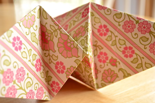
Ben's teacher was asking for families to donate any paper they might have for an origami project. When I went to my paper stash, one thing led to another and, voila! An experiment erupted. I know, you're surprised.
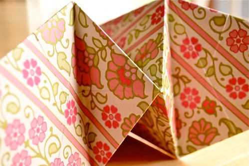
UPDATED: The experiment continues, thanks to Kim! She recommended a crop more in keeping with the rule of thirds. I would agree from a composition standpoint. My attention was more on the focus (learned that focusing in a shadowed area can be problematic!), and also exposure (the original was a bit washed out, so I bumped up the saturation and sharpness a little as long as I was in there editing). What I loved the most about this shot was the depth of field. With all the different "faces" and "points" of the origami, there was such great variation in the focused and blurred areas. I thought I lost a bit of this in the crop, but I still like the results. Thanks, Kim!


8 comments:
Very pretty indeed!
Lol, love your comment. This photo project does change the way we see, I'm convinced! It's lovely paper... I agree.
Do you want constructive criticism? (she humbly asked)
I'm doing a lot of photography coaching and I almost can't help myself.
Bring it on!
Ok! To me, this image cries out for the rule of thirds since you have two vertical lines. Crop the right side so that your two lines create even vertical thirds.
I like to crop proportionally, so you can also lose a little of the top and bottom so that your vertical lines appear to extend beyond the image.
This will visually strengthen your pattern and diagonals.
Have fun!
Oh, sorry that comment is from Kim. I'm logged in as Sandie. :)
Feedback is always welcome!! Thank you, ladies!
Looks great. Now I feel more balanced when I look at it. :)
(I shoot with such a shallow dof that none of it looks out of focus to me!)
Post a Comment